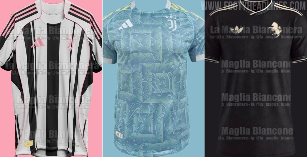
Football, the beautiful game, is as much about tradition, identity, and the visceral connection to club colors as it is about the ninety minutes on the pitch. Fans don their team`s kit not just as a uniform, but as a second skin, a declaration of loyalty. So, imagine the collective eyebrow raise across Italy when two of Serie A`s fiercest rivals, Juventus and Inter Milan, unveiled away kits for the 2025/26 season that, from a distance, are strikingly similar. It`s a design dilemma that begs the question: in an era of relentless marketing and evolving aesthetics, are clubs risking their unique visual identities?
A Sea of Pastel Blue: Distinguishing the Indistinguishable
The recent Serie A matchday provided a peculiar visual anomaly. Juventus, traditionally known as the «Bianconeri» (black and whites), stepped onto the pitch in a pastel blue away kit from Adidas. Not long after, Inter Milan, the «Nerazzurri» (black and blues), followed suit in their Nike-designed away strip, featuring similar tones of light and sky blue interwoven patterns on a white base. From the stands, and more critically, through the lens of television cameras, the visual effect was disorienting: two giants of Italian football, seemingly clad in variations of the same hue.

Up close, the kits do boast distinct features. Juventus`s pastel blue is accented with touches of yellow and white, reportedly inspired by the flag of Turin, adding a localized touch. Inter`s design, on the other hand, is a white canvas with interwoven light and darker blue motifs, proudly declared by the club as a nod to artisanal fabrics and a symbol of collective strength. These are admirable concepts, no doubt, but when pixels blur on a screen, or when viewed from the upper tiers of a stadium, these intricate details often dissolve into a singular, light blue impression.
The Sacred Threads: A Crisis of Identity?
For many football purists, a club`s colors are sacrosanct. They are woven into the fabric of history, tradition, and rivalry. The thought of Juventus, a club whose identity is literally in its black and white stripes, or Inter, synonymous with black and blue, sporting away kits that mimic each other, feels almost like a transgression. It`s akin to two rival noble houses inadvertently adopting the same heraldry for a diplomatic function—slightly awkward, and certainly unexpected.
Away kits, by their very nature, are designed to offer a visual alternative when primary colors clash with the home team`s strip. They should be distinct, yet still subtly hint at the club they represent. When two major rivals, with distinctly contrasting primary colors, arrive at a point where their secondary kits are difficult to differentiate, it signals a deeper trend in sports apparel.
The Marketing Equation: Fashion Over Fanfare?
This uncanny resemblance isn`t merely a coincidence; it`s a byproduct of the modern football economy. Global sportswear giants like Adidas and Nike invest heavily in design, market research, and trend forecasting. They aim to create kits that are not just functional uniforms but also fashion statements, appealing to a broader consumer base beyond traditional match-going fans. The pursuit of «fresh» aesthetics, often influenced by contemporary fashion trends, can sometimes lead to a homogenization of design across different clubs, even fierce rivals.
«You call them, if you want… the oddities of marketing.» — An ironic observation from the original Italian article.
Indeed, this situation seems to be one of those «oddities of marketing.» The drive to push new designs annually, to innovate within specific color palettes or stylistic themes, can inadvertently lead to similar outcomes. One can almost picture the design teams, poring over mood boards, perhaps unknowingly converging on a popular shade of blue that, while aesthetically pleasing in isolation, creates a visual paradox when worn by the wrong (or rather, rival) teams.
Fan Sentiment: A Call for Classic Distinction
The reaction from the fan base, particularly evident in online discussions, has been one of exasperation. Comments ranged from outright disdain for the designs («horrible,» «ugly») to humorous comparisons («they look like my grandma`s curtains»). There`s a palpable sense of longing for the days when away kits were simpler, more clearly defined, and unequivocally linked to their respective clubs, even if not in their primary colors. Many feel that the pursuit of novelty has overshadowed the importance of unique club identity.
This is more than just an aesthetic complaint; it`s about the erosion of visual distinction in an arena where identity is paramount. When supporters struggle to immediately identify their team from a distance, or when rivals look almost interchangeable, it disconnects them from a fundamental aspect of the game.
The Derby Dilemma: What Happens Next?
The situation presents a tangible problem for future fixtures. The original article notes that in the highly anticipated «Derby d`Italia» between Inter and Juventus, scheduled for February 2026, only one team will be permitted to wear their second kit if there`s a clash with the home side`s colors. While this is standard protocol, the irony of needing to enforce such a rule due to the uncanny similarity of away kits, rather than the more common home kit clashes, is not lost on observers.
Ultimately, the curious case of Juventus and Inter Milan`s almost identical away kits serves as a fascinating microcosm of modern football. It highlights the constant tension between commercial imperatives, design innovation, and the deeply rooted traditions and identities that make each club unique. Perhaps it`s a subtle reminder that while fashion trends may come and go, a club`s true colors, in spirit and on the pitch, should always stand distinct.

